Giving your webpage a beat; the art of a rhythmic design.

- 1168 Views
- 0 Comment
- Design . Tips and Tricks . user experience .
Rhythmic success is the way in which a visitor moves through your web page.
Designing your webpages with balanced design principals can help the flow of your webpage. Applying these balance concepts such as: contrast, proximity, spacing, and repetition can guide your visitor on what to focus on. Working with good typography and easy to digest headlines can produce great visual rhythm.
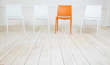
So what is Rhythm? Simple, a repeated pattern (imagine your favorite song or melody, it is just repeating beats). A consistent pattern will allow the end user to predict more is coming which can entice them to continue on a webpage. Vertical rhythm is the layout of content that keeps the user scrolling by using those balance concepts above. A webpage with good vertical rhythm uses headline to text ratios that fit the attention span of your audience. Using the baseline grid to guide your content is an easy way to align text and objects to while keeping repetition in mind. Yet, this repetition should be broken at times to give a dynamic feel to your content. The goal of adding rhythm to your content is to improve the focus of your users to the important areas and to make sure they don’t get lost in a wall of text.
Individuals who are coming to your site (unless a web-design fanatic), will not be overly focused on the design of your site. They will be searching for the one thing they came looking for. Making sure that it is easy to find will help ensure they don’t leave your site and look for it somewhere else. Paying attention to visual rhythm will lead your users to what they came for.
Comments
Check out our video webinar 3 strategies to increase active engagement and learn the leading new method to making your members addicted to your associations web site!


OUR RECENT
WORKS
-
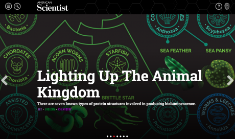
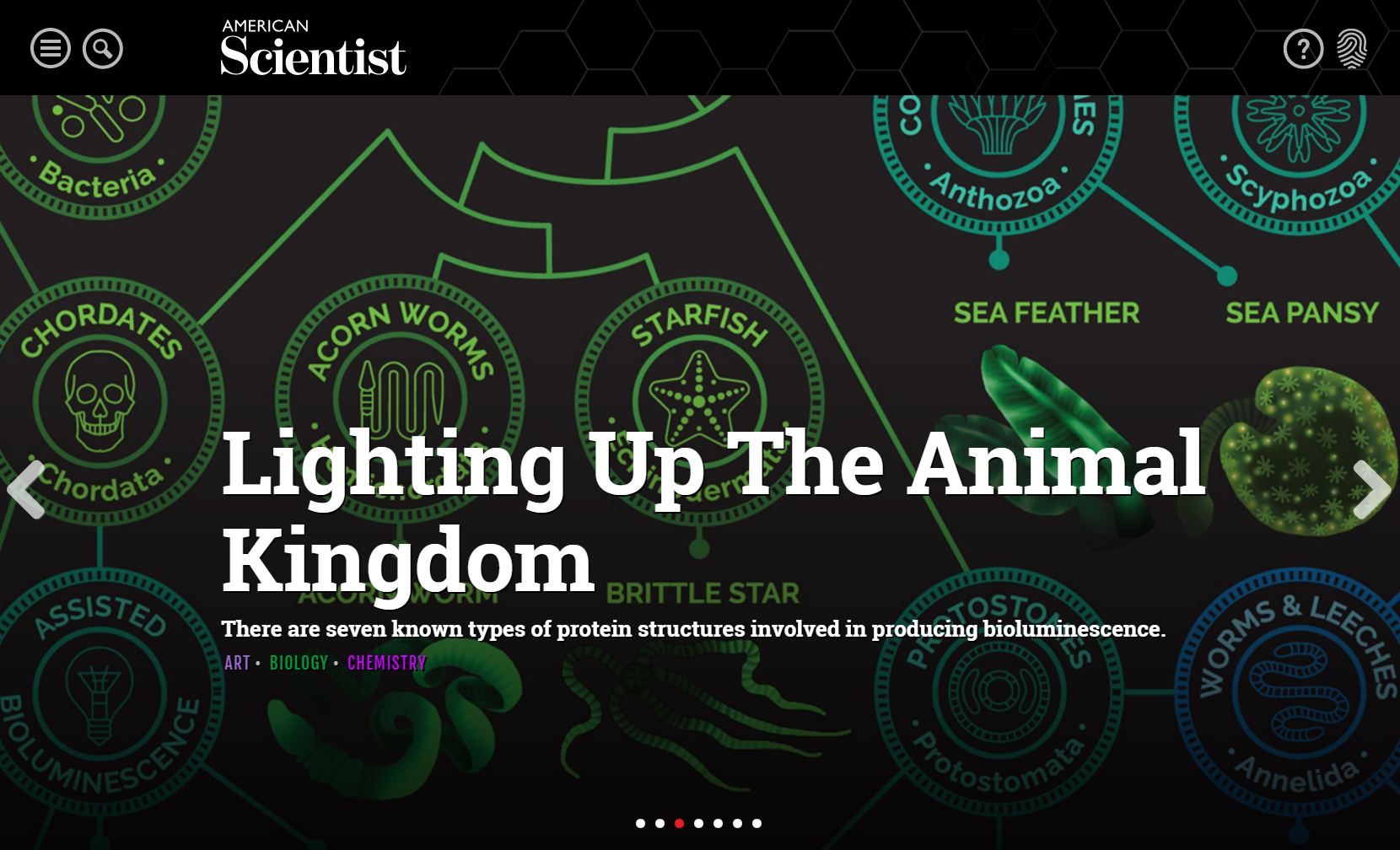
American ScientistOnlineLearning
-
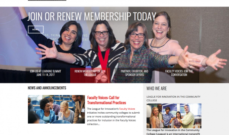
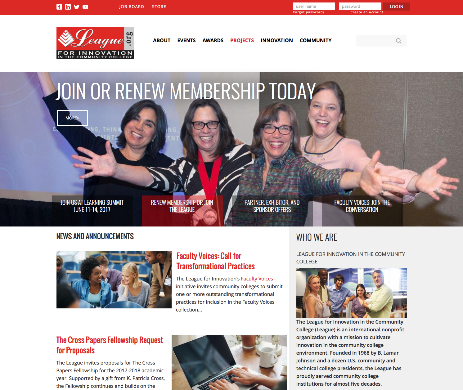
The League for…OnlineCommunity
-
California Association of…OnlineLearning
-
Building Owners and…OnlineCommunity
-
Indiana Bankers AssociationMobileFriendly
-
American Society of…OnlineCommunity
-
Tire Industry AssociationMobileFriendly
-
American Academy of…OnlineCommunity
-
National Association of…Commerce
-
American Society of…CMSIntegrationtoAMS
-
National Association of…DesktopApps
-
Long Beach Water…DesktopApps
-
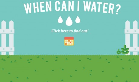
Castaic Lake Water…OnlineLearning
-
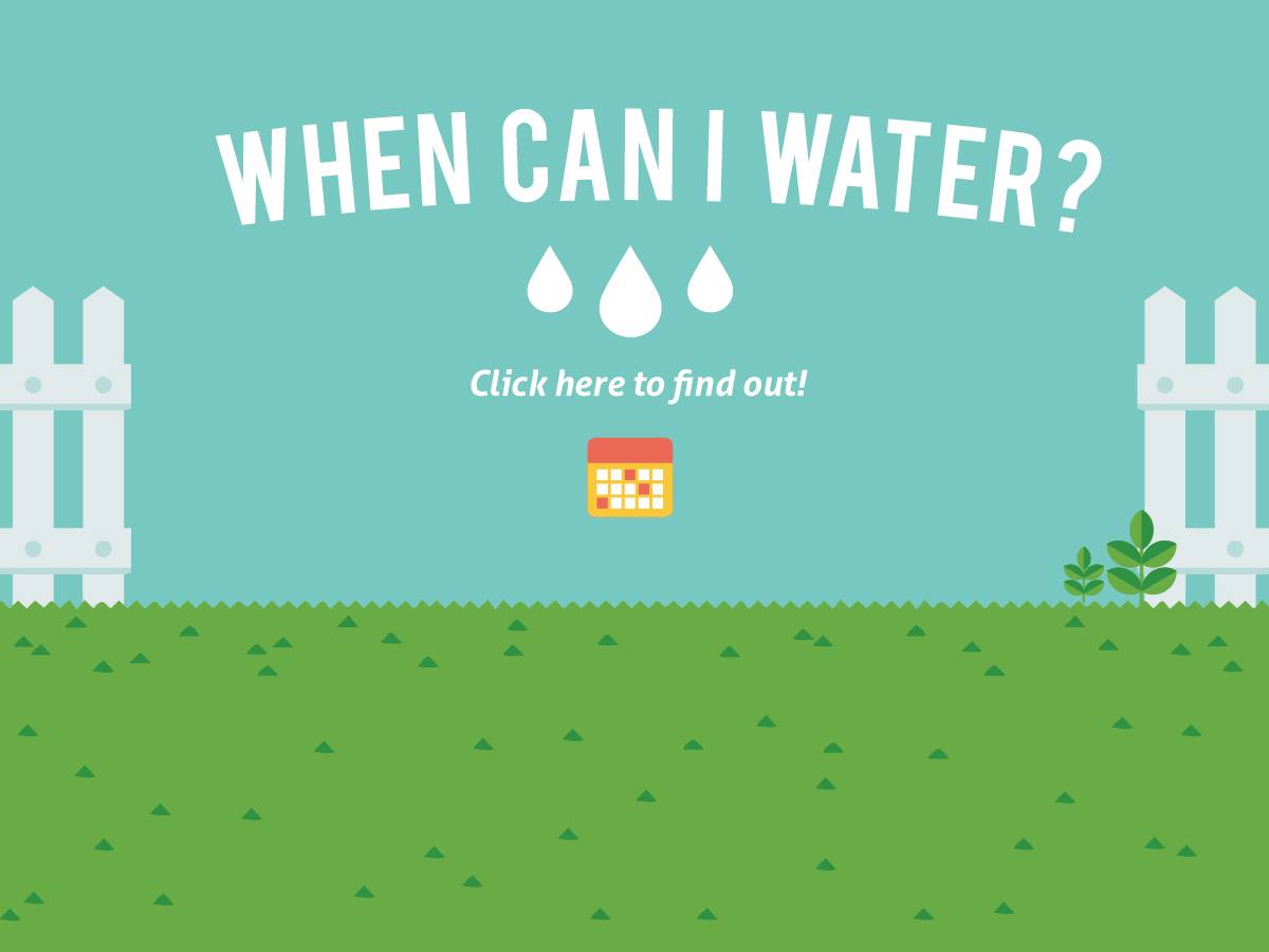
Water Smart San…OnlineLearning
-
San Diego County…MemberSuite
-
Change Management InstituteMemberSuite
-
American Society of…CMSIntegrationtoAMS
-
American Association of…OnlineCommunity
-
Building Owners and…CMSIntegrationtoAMS
-
Council of Chief…CMSIntegrationtoAMS


