Keep it simple silly

- 6158 Views
- 0 Comment
- No tags
In the digital age, real estate can feel endless. There’s no print cost, and online storage is getting cheaper by the day. This has given us the ability to store and offer more information than ever before. The number of articles, blogs, whitepapers and so on that can be published is virtually limitless. You, as the association, can provide your members with every iota of information they could possibly want or need. So there is clearly no problem with quantity.
And quality isn’t an issue, either. You’ve spent years, perhaps decades culling the best talent, the sharpest minds, the leaders of industry to write your publications; your content is top-shelf. And if you’ve spent decades acquiring the talent, then it’s likely that you have decades of back-catalog, too. You can offer your members thousands of articles, expertly written, useful for research, and staying on top of the game in their professional field. So no, quality isn’t the problem.
What is the problem then? If you parse over your analytics, are members staying on your site for extended periods of time? Are they excited to renew their memberships, and recommend your association to their colleagues? Are you attracting younger members? If you find that you aren’t happy with any of these areas, or just want to see them improve, then your problem might be with the way your content is presented.
We’re not talking so much about the layout of individual articles, but more about the layout of your homepage. You have so much great content, you want to make sure your members aren’t missing any of it, and the data shows that your website’s landing page is the most important place to grab peoples attention. So there’s a certain logic to wanting to display as many wonderful articles as possible there. But this approach is wrong.
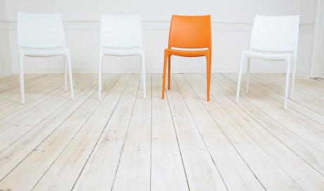
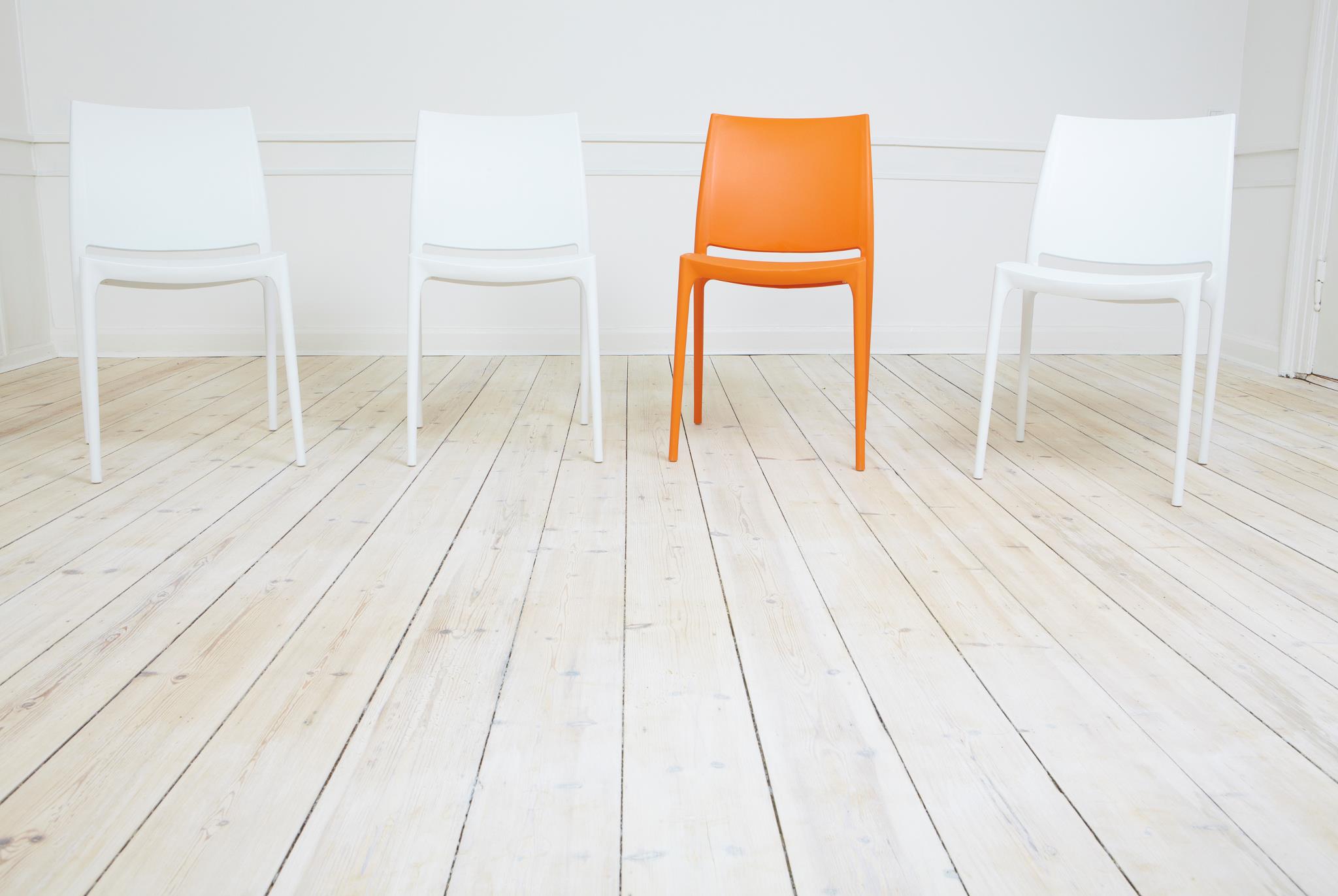
In the title, I call it the “art..” of minimalism, and I use the word “art” not to sound poetic, but because there is an art-form to it. Think back to your favorite Disney cartoons from when you were a child. Think of the faces of the characters, and what stands out. Perhaps it’s their big doe-eyes, the simple line of their nose, or their experssionate mouth. But take a closer look: notice the simplicity, the lack of detail. Cartoonists learned early on that our eyes are drawn to the most important features of the human face, and a good way of accentuating that is by cutting out other details. This is how your website should be designed. You want to accentuate the core theme or message of your association. This will draw your members in, and make them want to dig deeper to find content on their own.
I also called it a science, and that, too, was no accident. In scientific terms, calling attention to only the important areas of something is called peak shift. In his lecture on the science of art, director of cognitive science at UCSD, Vilayanur Ramachandran describes this peak shift as our brains seeking out efficiency. Our brains are wired to cut through the clutter, and are attracted to things that give us the most important information free of extraneous detail. He references caricature art as a prime example, noting that a famous figure can be immediately recognized by highlighting their most prominent features, and excluding the little details that get in the way of the more important ones.
Your homepage should utilize this peak shift principal. you don’t need to link to as many important articles as you can cram into that space; after all, they’re all important. Instead, you should highlight the ones that best represent your core values. Providing too much information, especially on your homepage, could also be doing harm.
In his book “The Paradox of Choice“, Barry Schwartz points out that retailers sale more when they offer less. That is because our brains can feel overwhelmed when we are offered too much, and it may render us unable to chose. We may feel that we need more time to think about which item to purchase when we have so many to chose from.
The same applies to your website. If you have dozens and dozens of articles listed on your homepage, your members may not be able to find a good starting point, and might end up leaving your site without reading a single one. However, if you offer just a few important ones, they will have an easier time finding one to start with, and like Lay’s Potato Chips, one is never enough.
Comments
Check out our video webinar 3 strategies to increase active engagement and learn the leading new method to making your members addicted to your associations web site!


OUR RECENT
WORKS
-
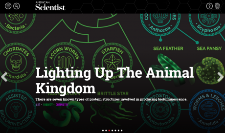
American ScientistOnlineLearning
-
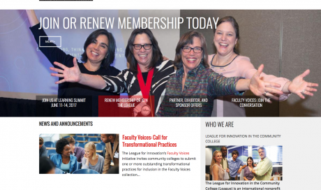
The League for…OnlineCommunity
-
California Association of…OnlineLearning
-
Building Owners and…OnlineCommunity
-
Indiana Bankers AssociationMobileFriendly
-
American Society of…OnlineCommunity
-
Tire Industry AssociationMobileFriendly
-
American Academy of…OnlineCommunity
-
National Association of…Commerce
-
American Society of…CMSIntegrationtoAMS
-
National Association of…DesktopApps
-
Long Beach Water…DesktopApps
-
Castaic Lake Water…OnlineLearning
-
Water Smart San…OnlineLearning
-
San Diego County…MemberSuite
-
Change Management InstituteMemberSuite
-
American Society of…CMSIntegrationtoAMS
-
American Association of…OnlineCommunity
-
Building Owners and…CMSIntegrationtoAMS
-
Council of Chief…CMSIntegrationtoAMS


