Go Responsive
- 1557 Views
- 0 Comment
- No tags
 Take out your smart phone, it’s time for an experiment! Let’s pretend you are a member of your association looking to find some important information on the fly. Now, go to your association website and find what you are looking for. How long did that take? Was the information easy to find? Could you even read it?
Research shows that, if visitors can’t find what they are looking for on your website in the first 10 seconds, they are likely to look elsewhere. But if you can keep them for 30 seconds, they will stay for an eternity (in web time of course) .
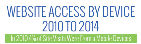
Today, 1 in 3 visits to your website will be from a mobile device. That’s a 171% increase from just two years ago and these numbers will keep going up. This means that if your website is not designed to be quickly usable on a Smart phone or tablet 30% of your members – and potential members – will probably lose interest and leave your website before they find what they are looking for.
While these statistics are alarming, your association does not have to break the bank on a mobile application or separate mobile site to stop the digital bleeding.
Websites today can be built responsively. This means that your website automatically recognizes the screen size of the visitor’s device and arranges the website to be optimized for viewing on that screen size – from smart phone to big screen TV.
Good responsive design ensures that everyone can find what they are looking for quickly, keeping visitors where they belong – on your website! If you are thinking about a website redesign, make sure you go responsive.
Comments
Check out our video webinar 3 strategies to increase active engagement and learn the leading new method to making your members addicted to your associations web site!


OUR RECENT
WORKS
-
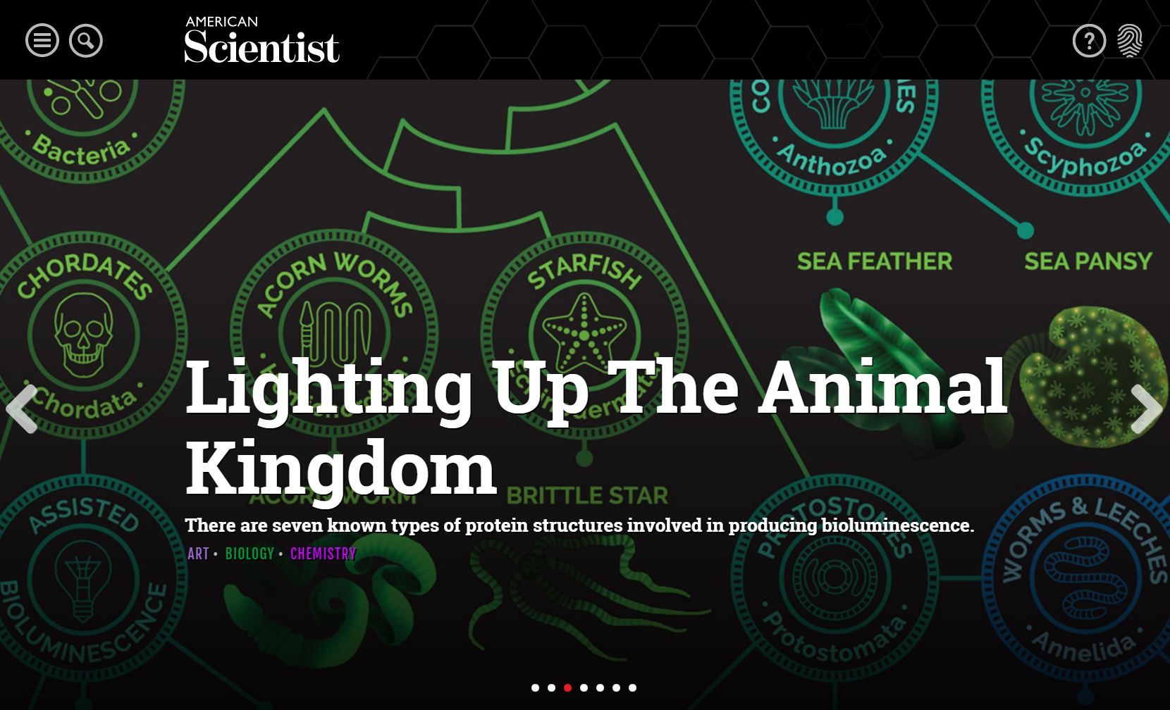
American ScientistOnlineLearning
-
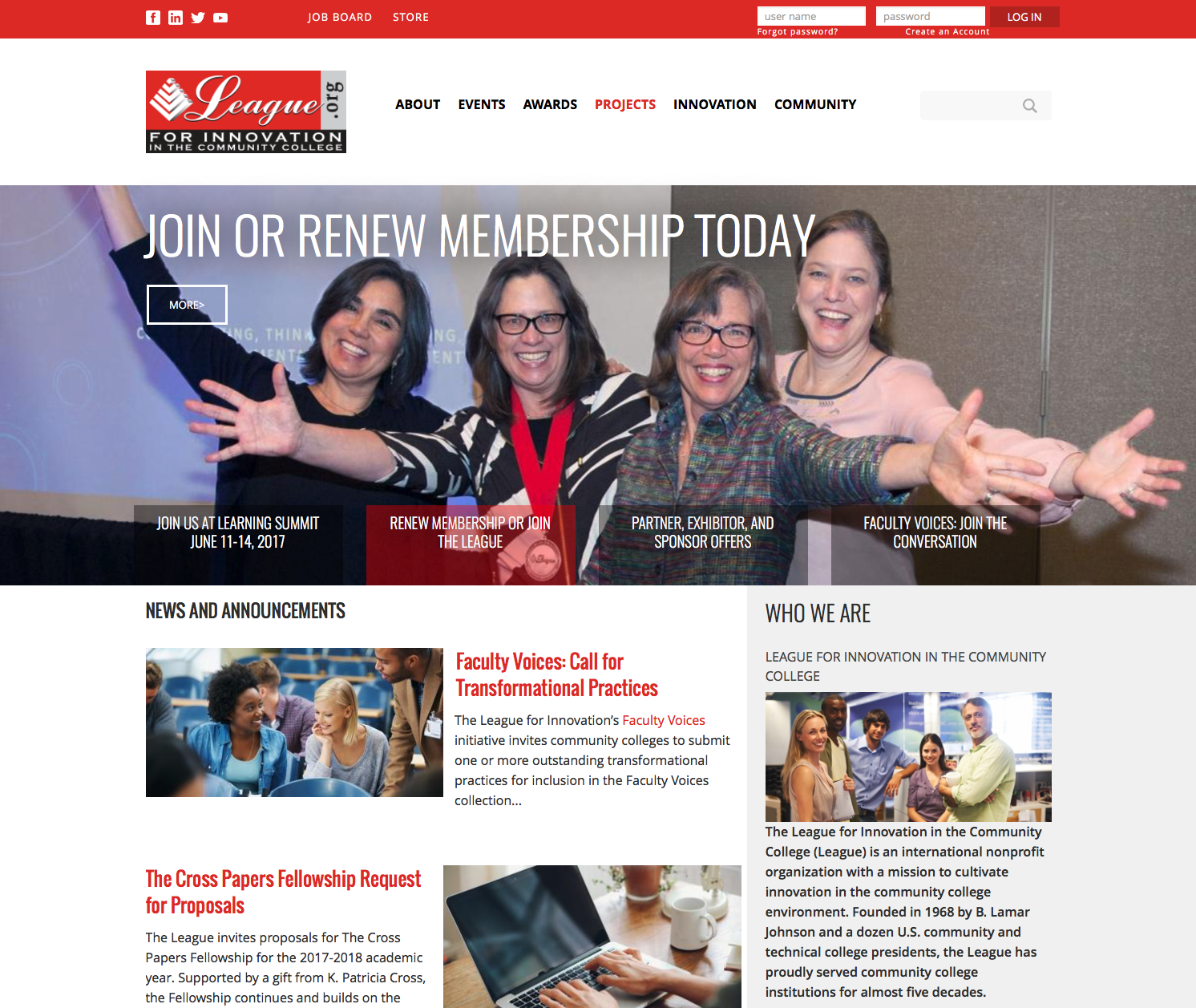
The League for…OnlineCommunity
-
California Association of…OnlineLearning
-
Building Owners and…OnlineCommunity
-
Indiana Bankers AssociationMobileFriendly
-
American Society of…OnlineCommunity
-
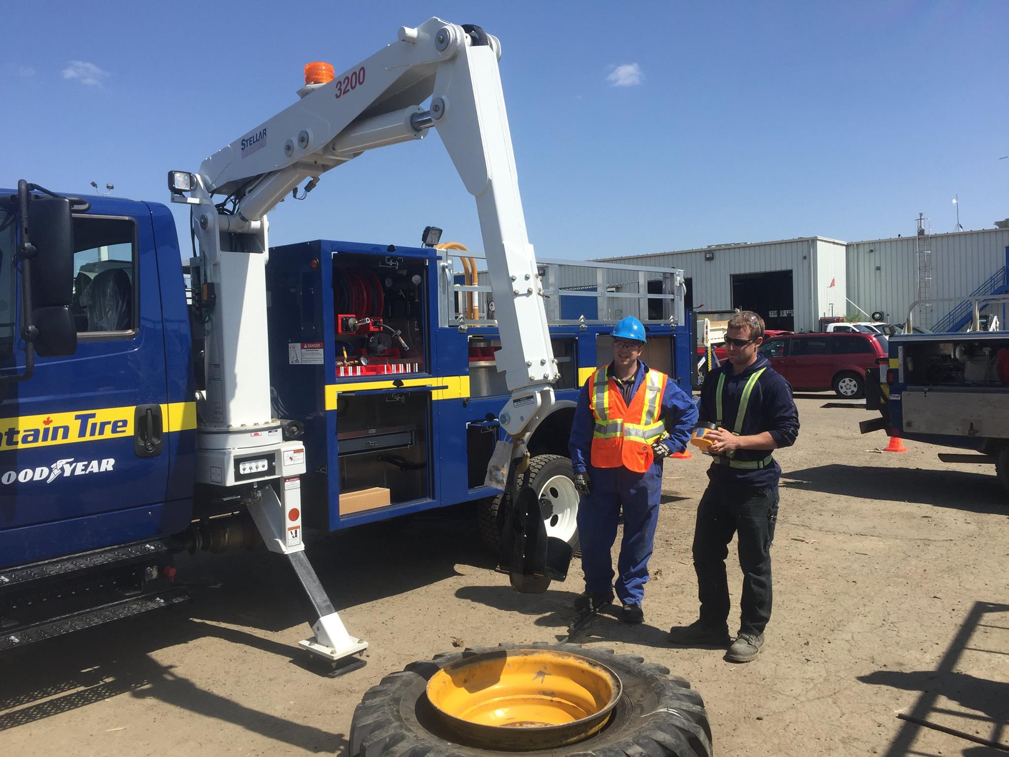
Tire Industry AssociationMobileFriendly
-
American Academy of…OnlineCommunity
-
National Association of…Commerce
-
American Society of…CMSIntegrationtoAMS
-
National Association of…DesktopApps
-
Long Beach Water…DesktopApps
-
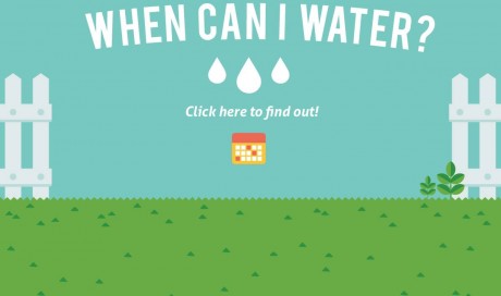
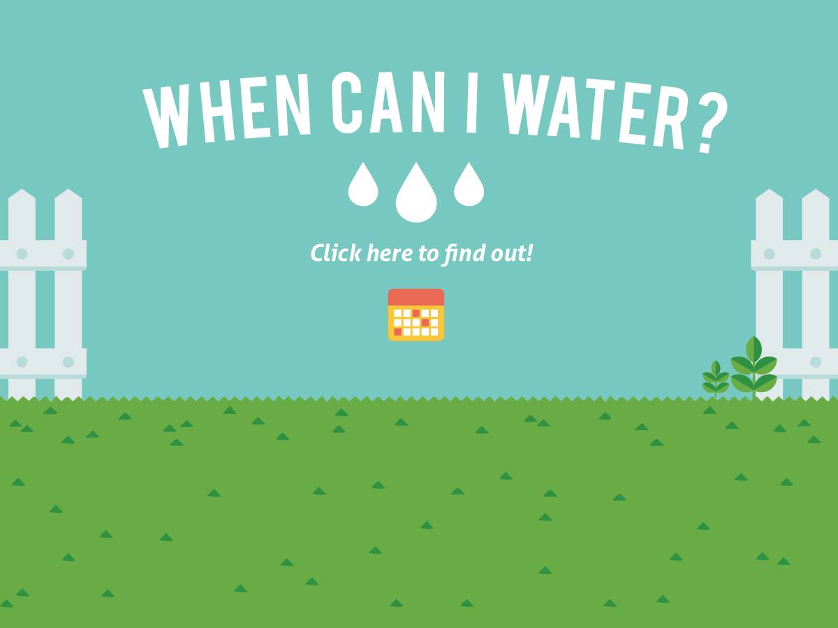
Castaic Lake Water…OnlineLearning
-
Water Smart San…OnlineLearning
-
San Diego County…MemberSuite
-
Change Management InstituteMemberSuite
-
American Society of…CMSIntegrationtoAMS
-
American Association of…OnlineCommunity
-
Building Owners and…CMSIntegrationtoAMS
-
Council of Chief…CMSIntegrationtoAMS


